Quality doesn’t happen by chance.
It is something we guarantee.
Brand Management
Branddesign
Custom Made
Decoration
Design
Event
Fairs & Promotion
Foliation
Illuminated advertising
Interior Design
Orientation System
Package Design
Print
Production
Technic
Webpages
All
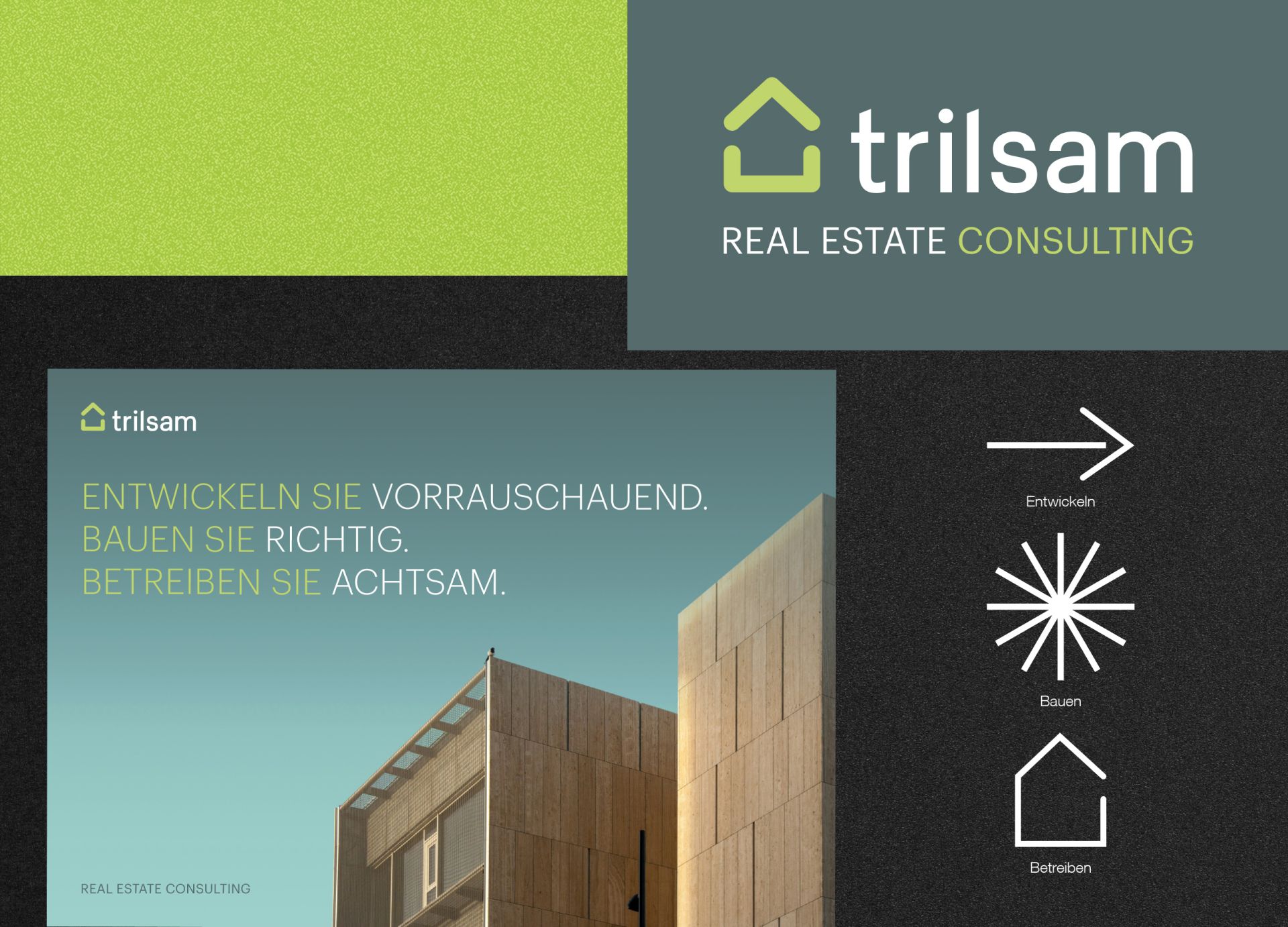
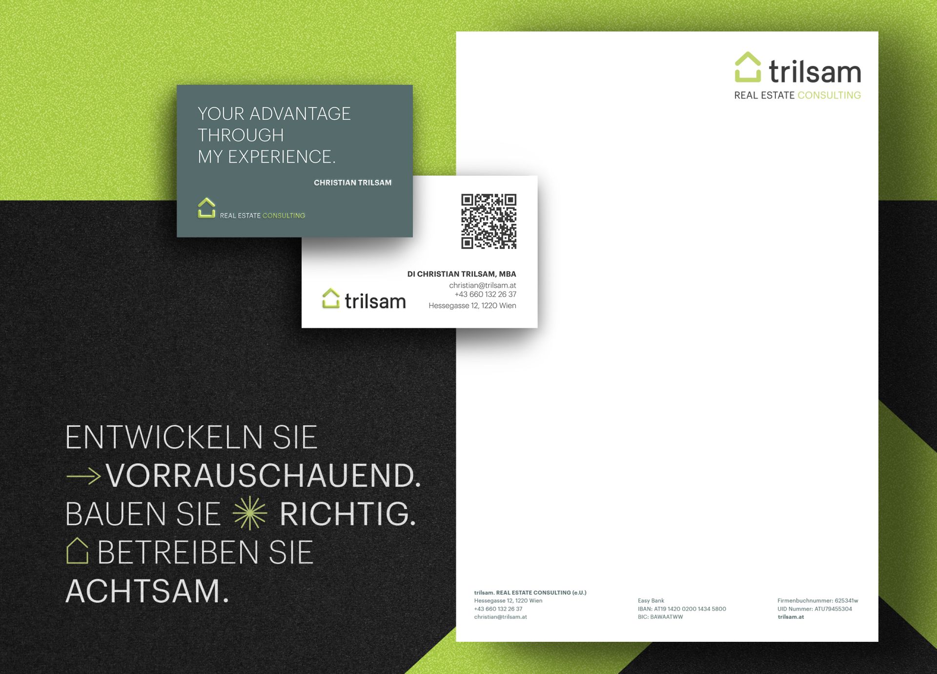
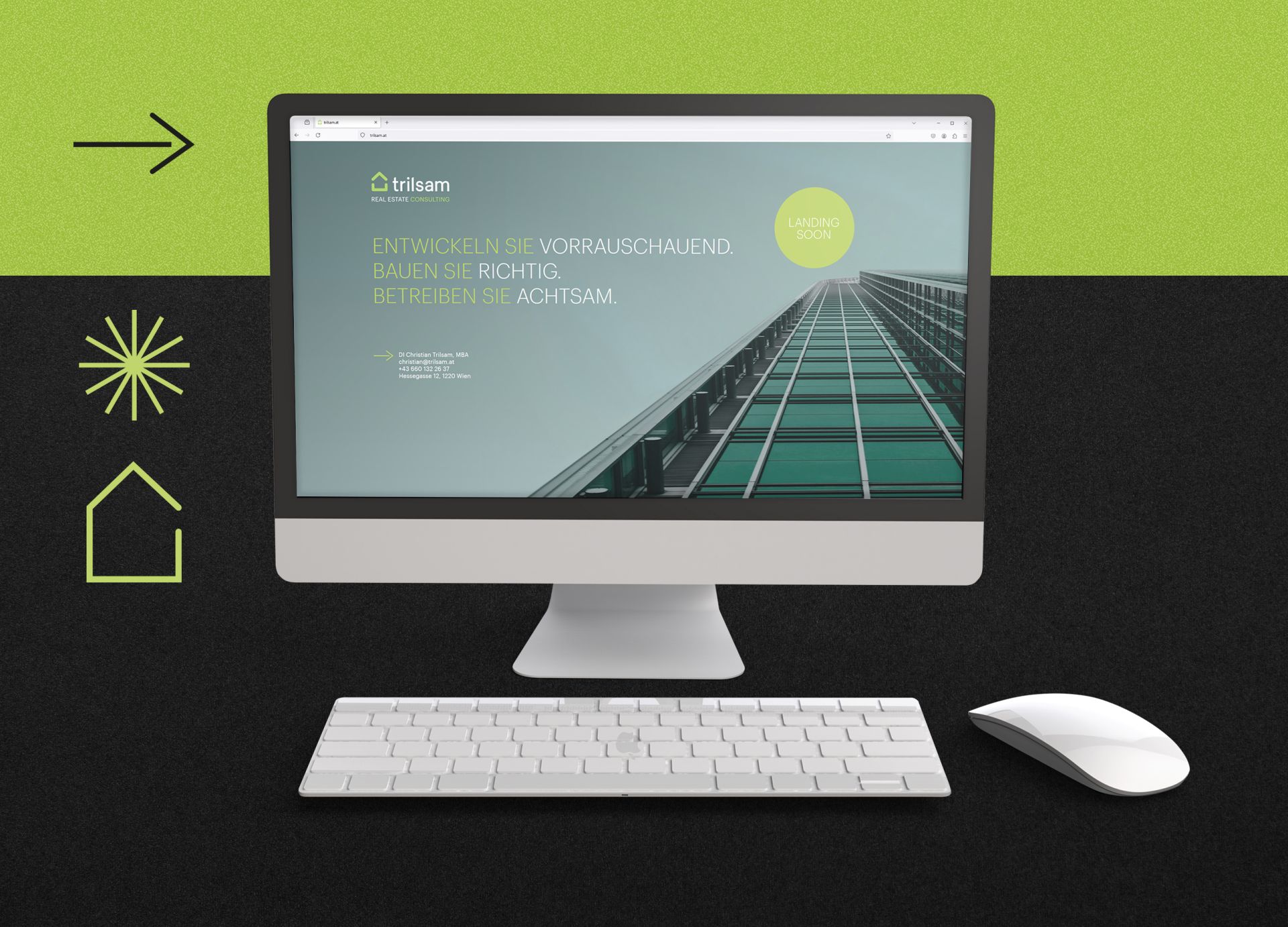
trilsam. REAL ESTATE CONSULTING
Logo and Corporate Design
The design as a path to a new, strategic presence. The corporate design reflects the identity, experience and reliability. Unique icons and appealing colours dominate the visual concept and underline the brand presence.
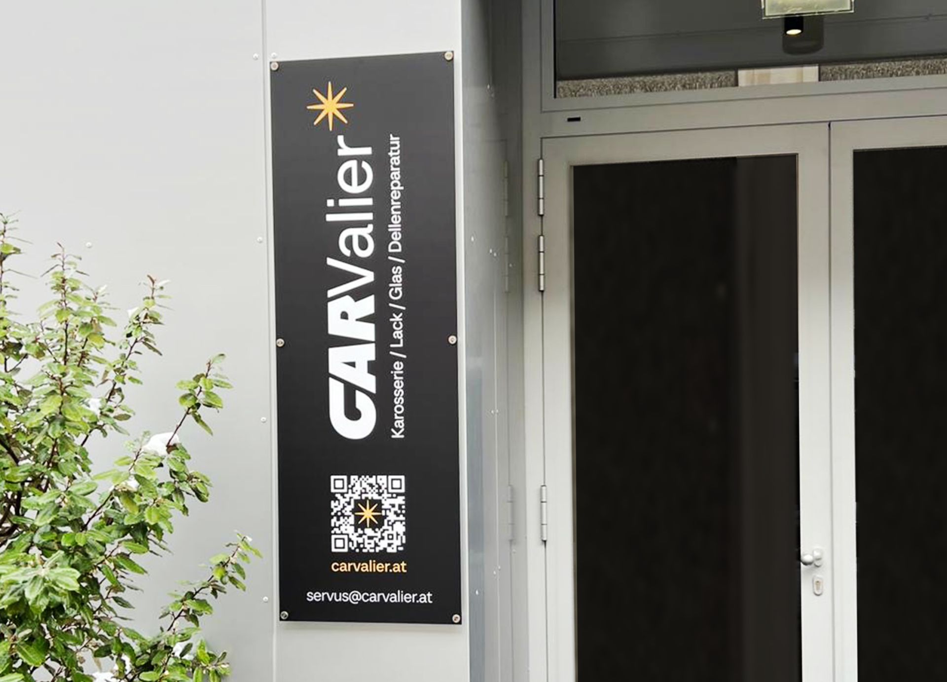
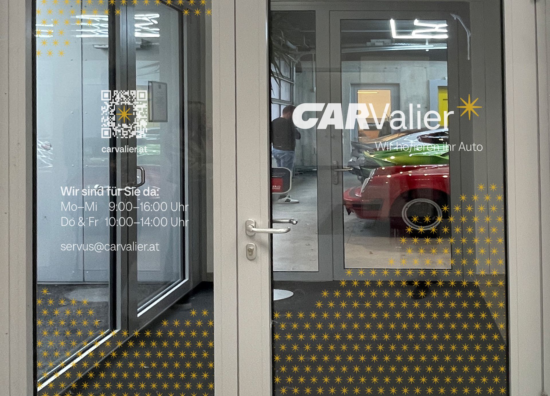
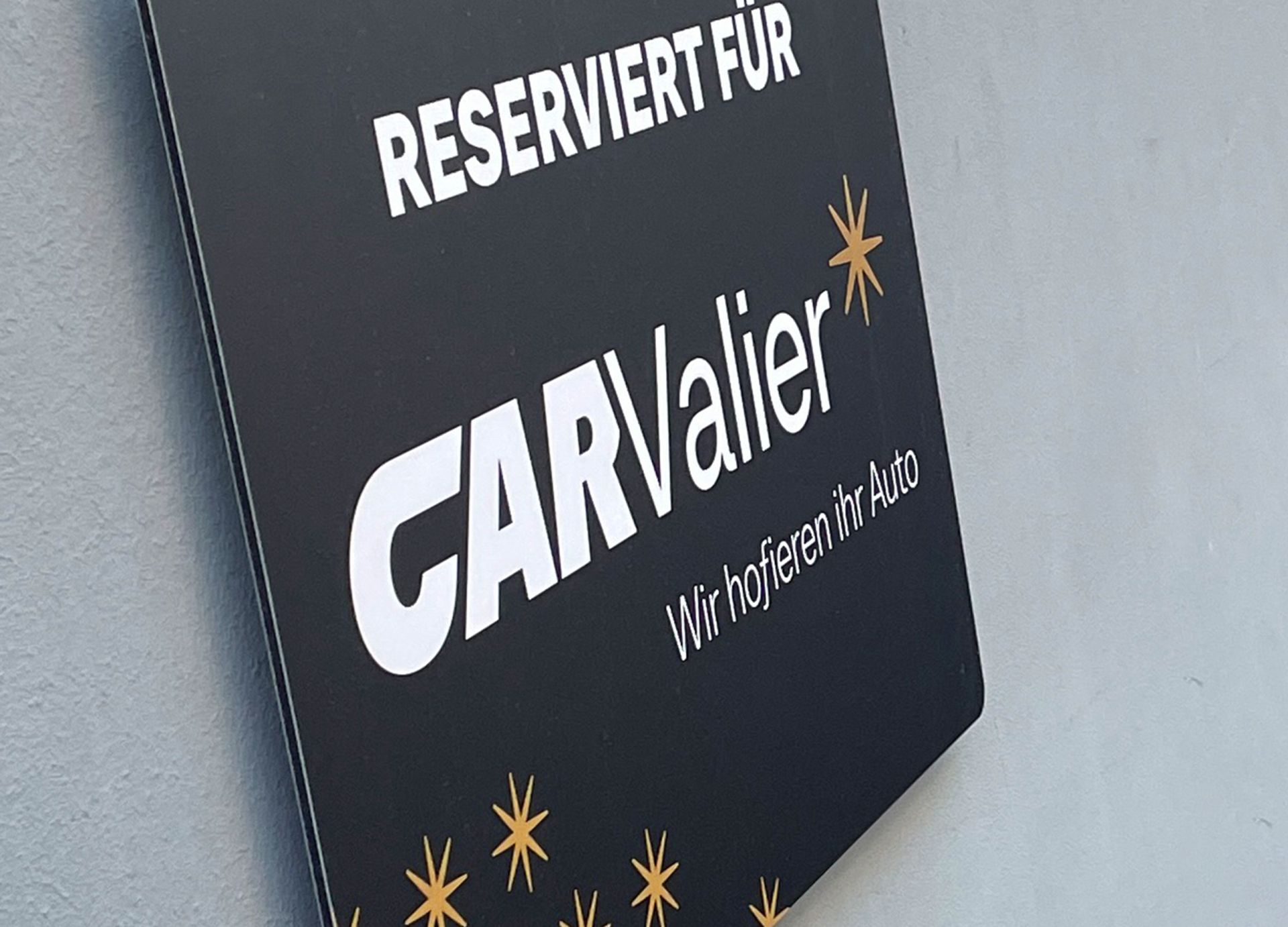
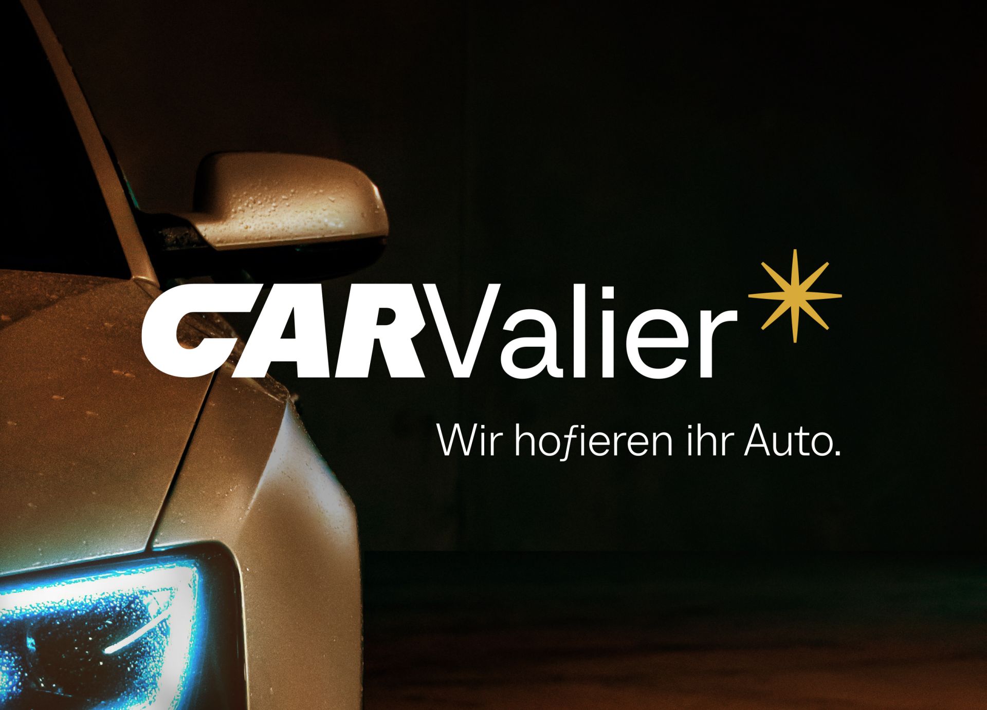
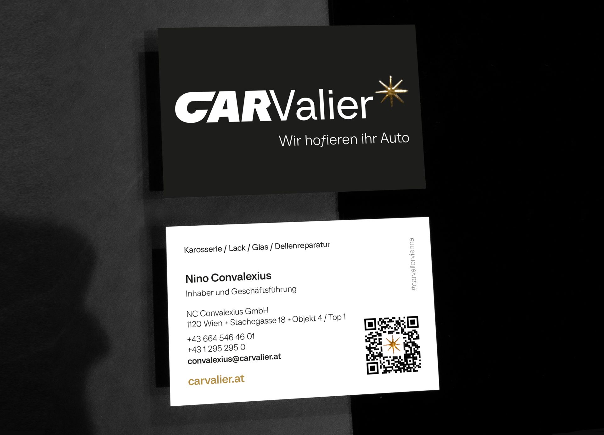
CARVALIER - NC Convalexius gmbh
Brand design and realisation
The new brand is also reflected in the high-quality location branding - glass foiling, signage and signage system.
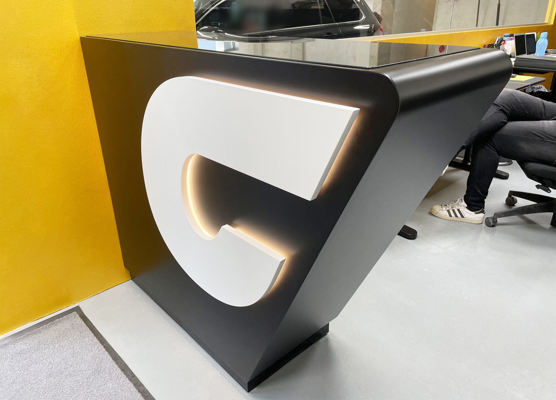
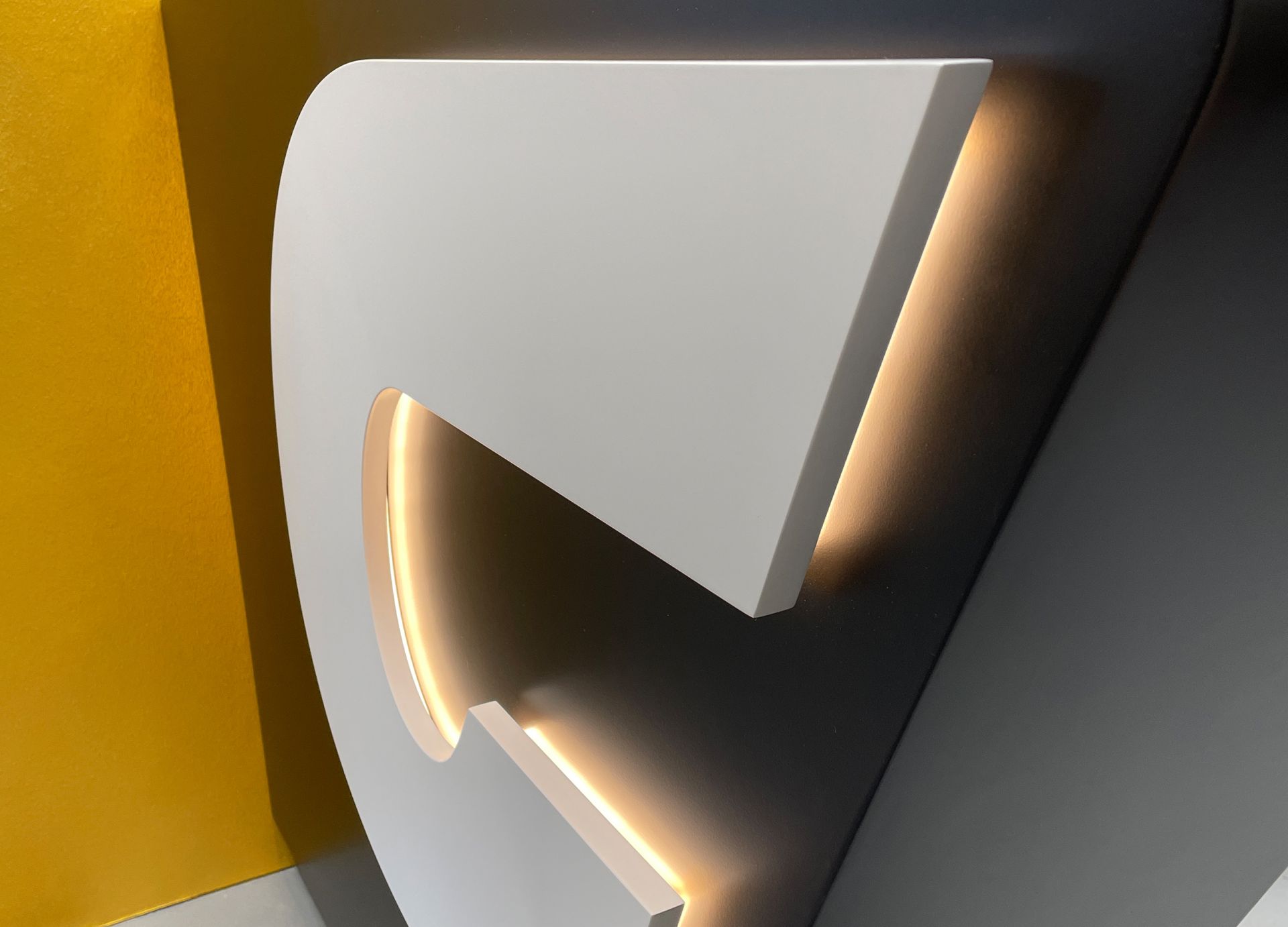
CARVALIER - NC Convalexius gmbh
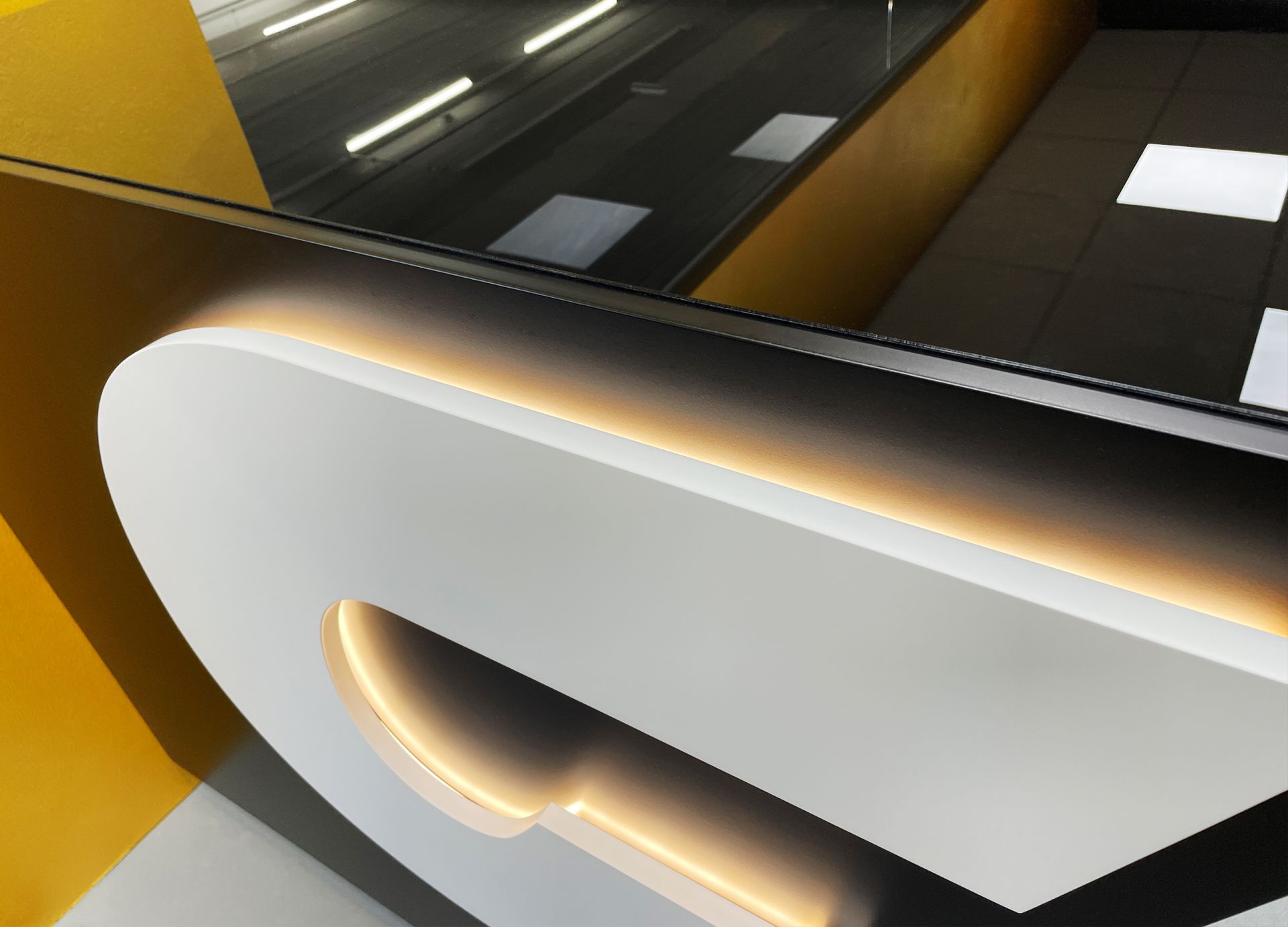
Sales desk with signet as a design element
Design and realisation of the sales desk for the new location. The customised table shape perfectly reflects the dynamic start-up. The backlit, raised signet as an eye-catcher on top.
Nino Convalexius
The Carvalier – welcome
The focus: the idea for the new name, the creation of the logo including the word and figurative mark for the various communication segments. Self-confident and inviting, the Carvalier attracts customers with Viennese charm and outstanding service. Visual language meets concise signet - glamorous and with style.
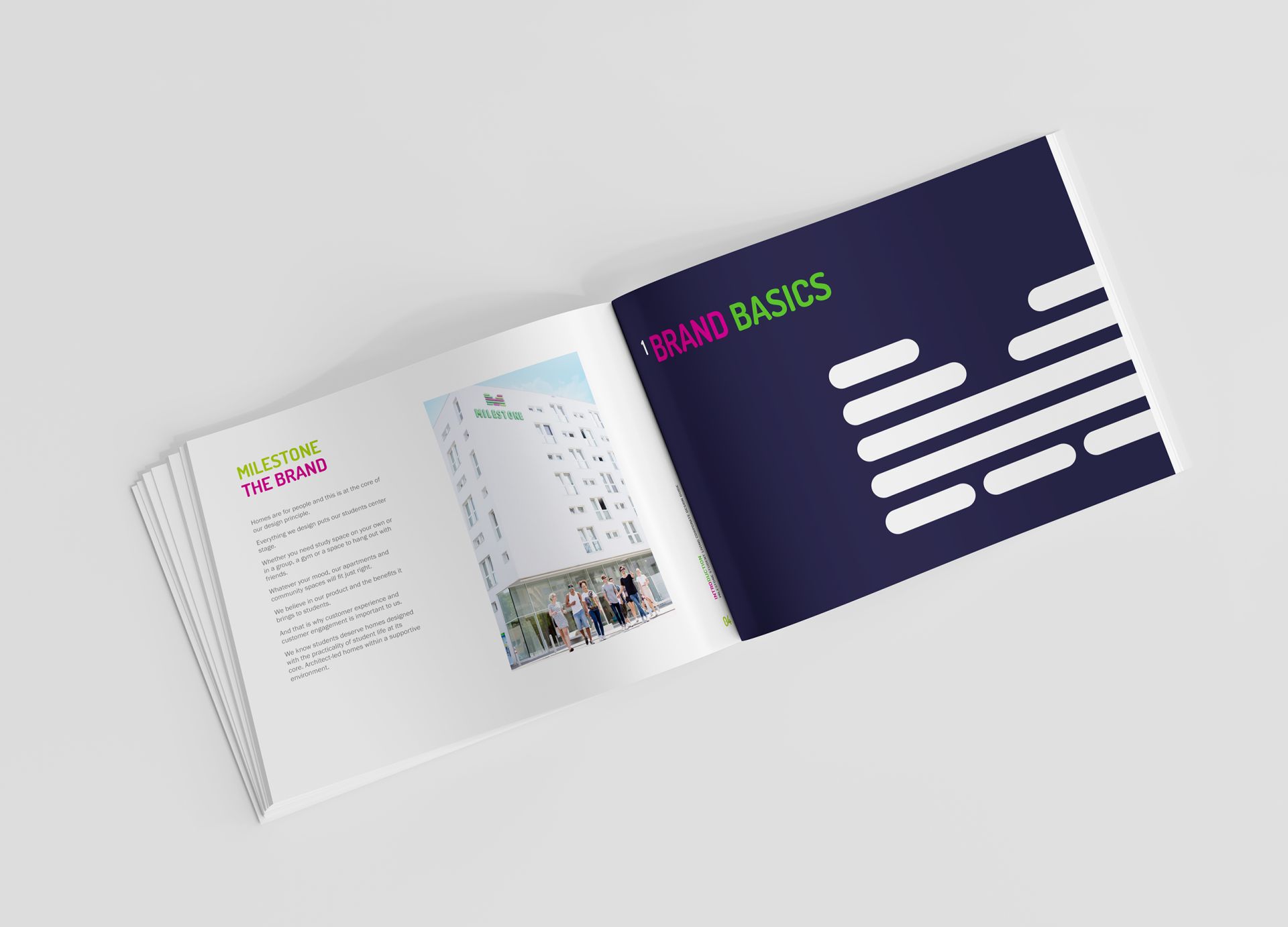
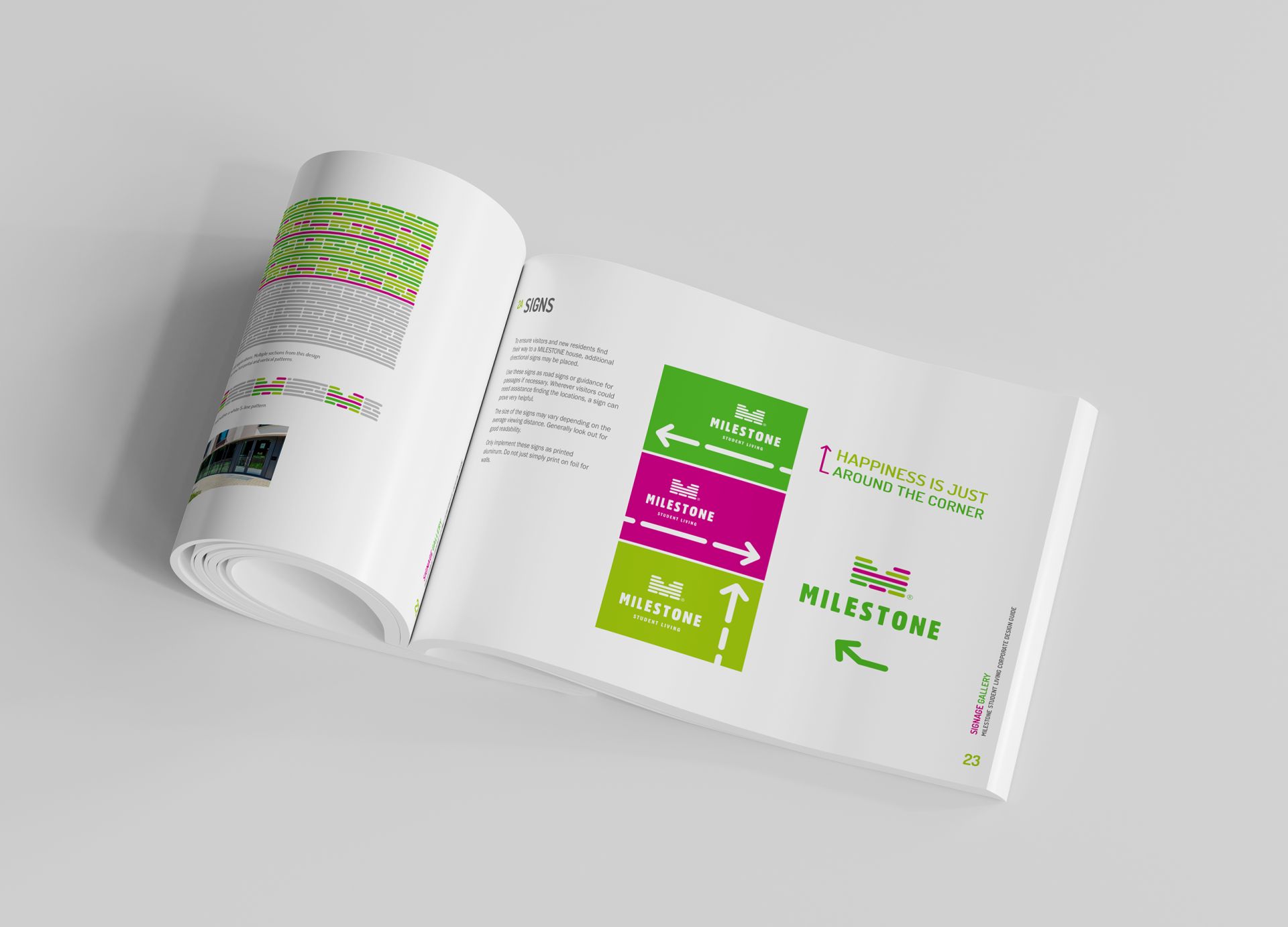
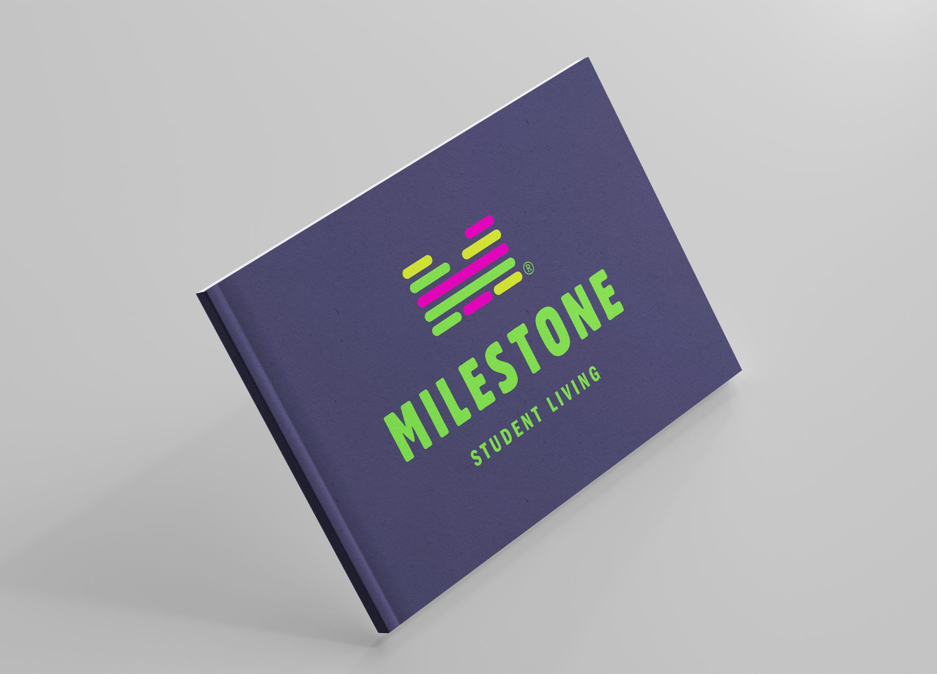
Milestone Student Living
Corporate Design Manual House Branding
Development of a detailed signage guide for the branding of new Milestone Student Living houses worldwide and the development of all design guidelines including a very extensive template library.
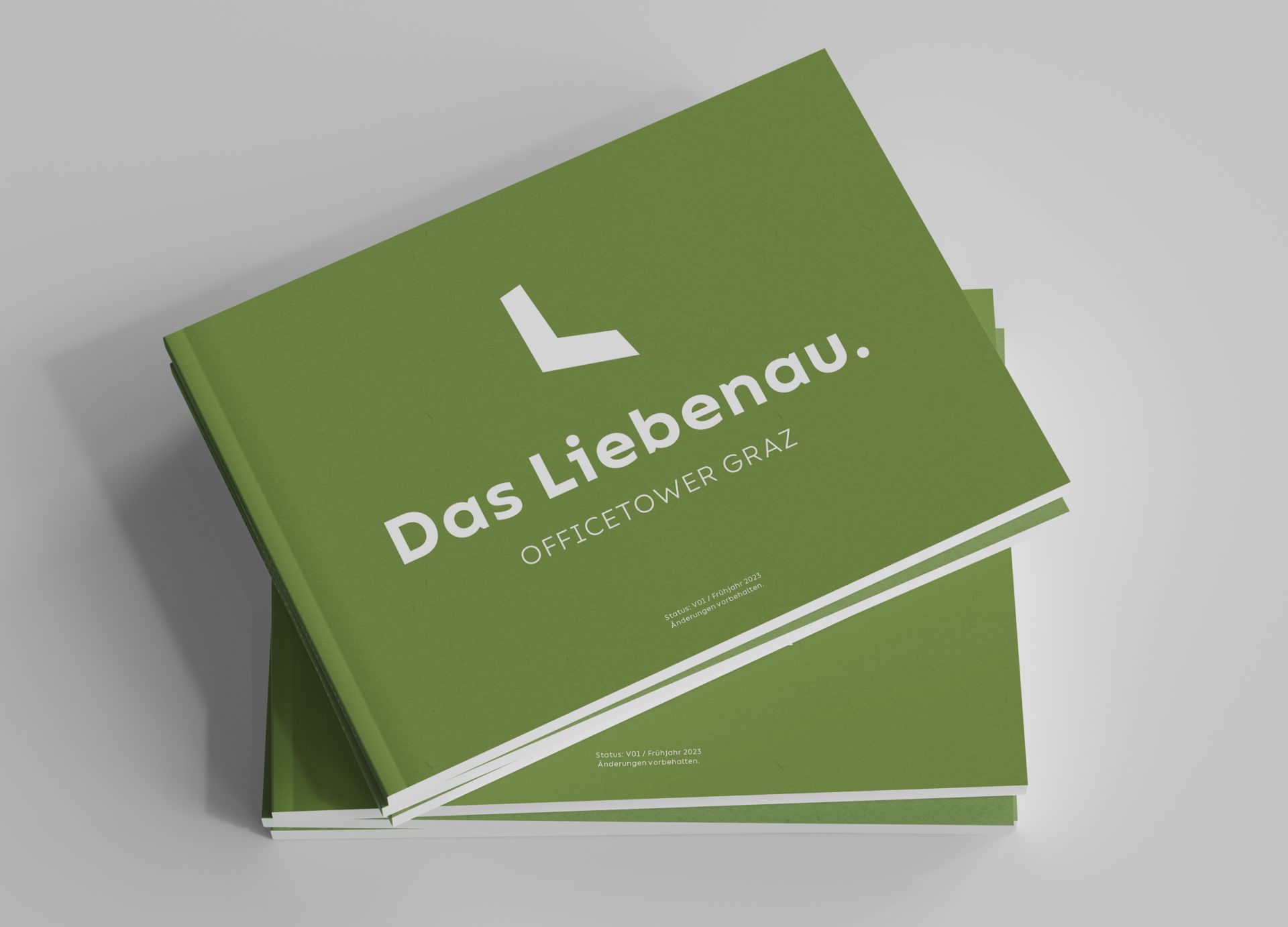
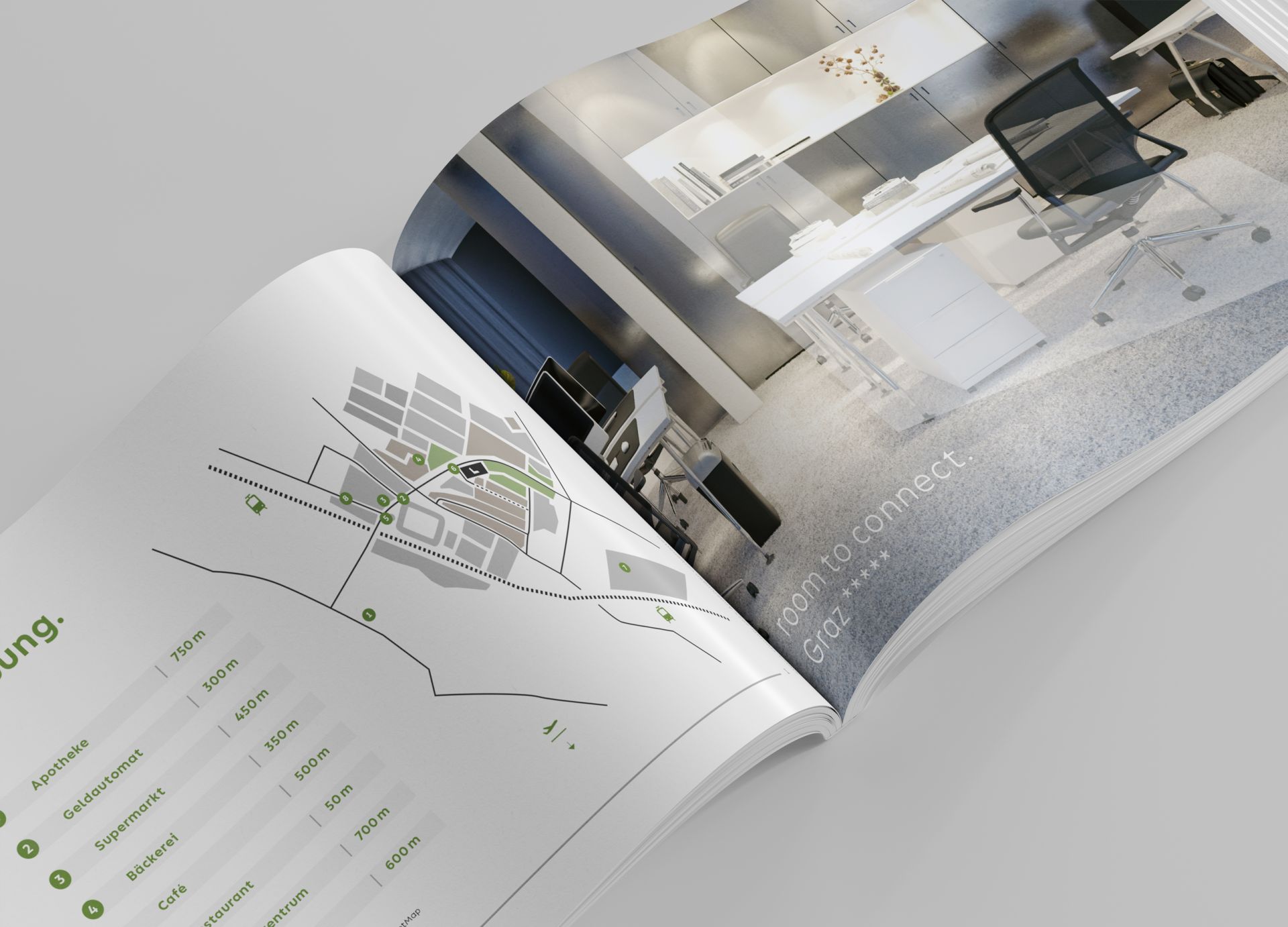
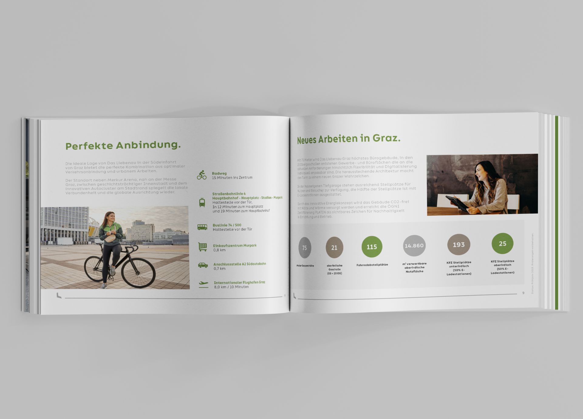
Liebenauer Tangente 8 Projekt GmbH (BauConsult und Aventa)
Das Liebenau. Exposé.
An exposé with all project-relevant information, facts and figures was developed for marketing.
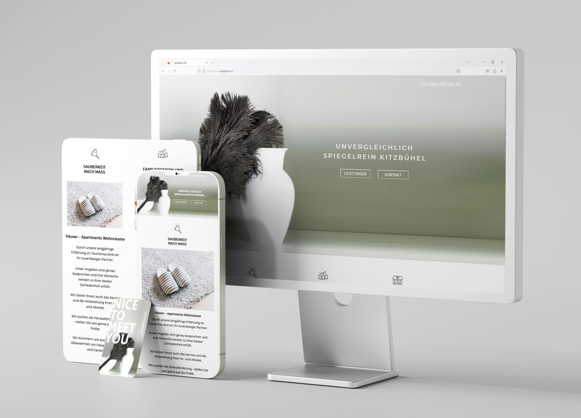
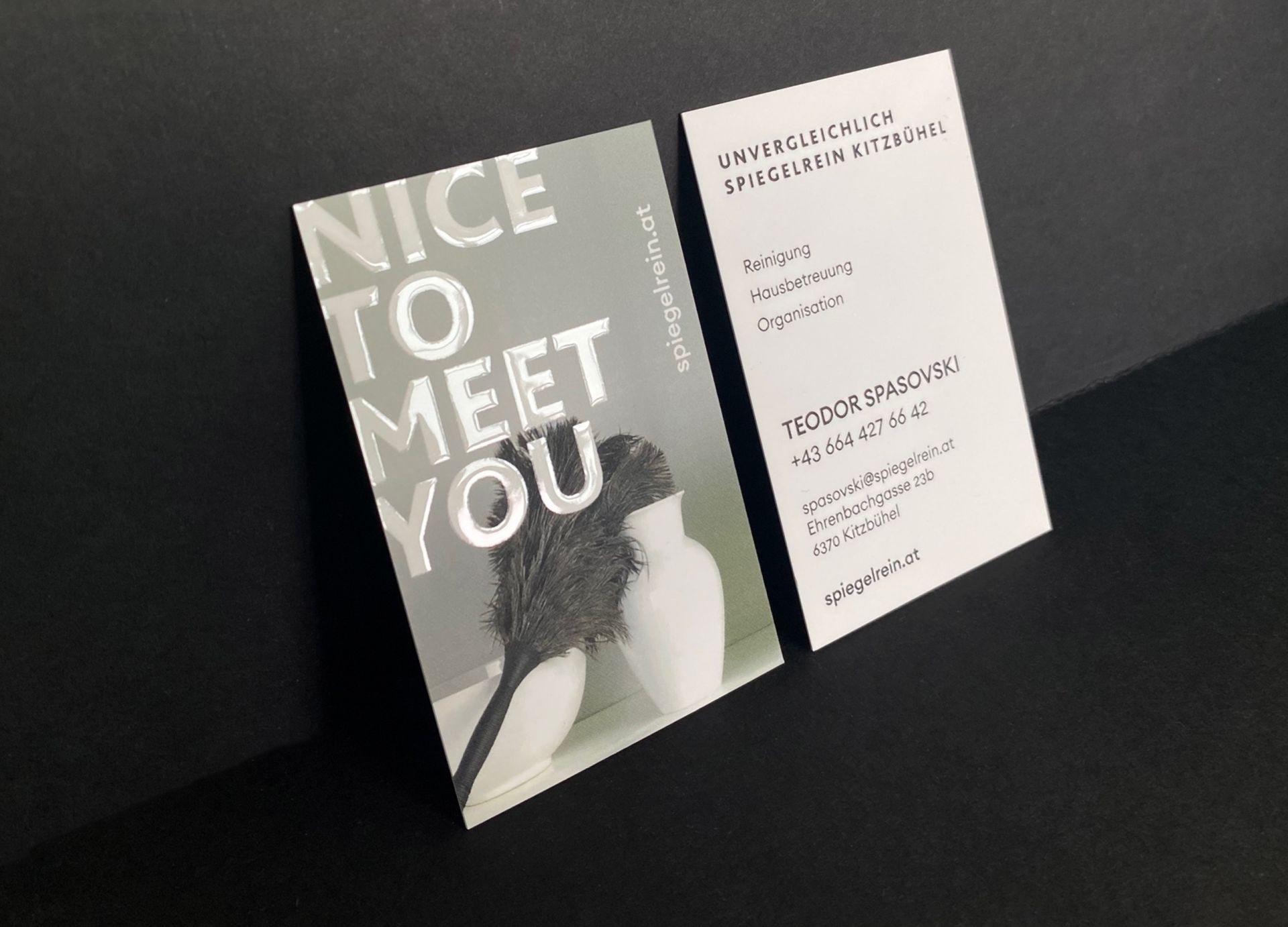
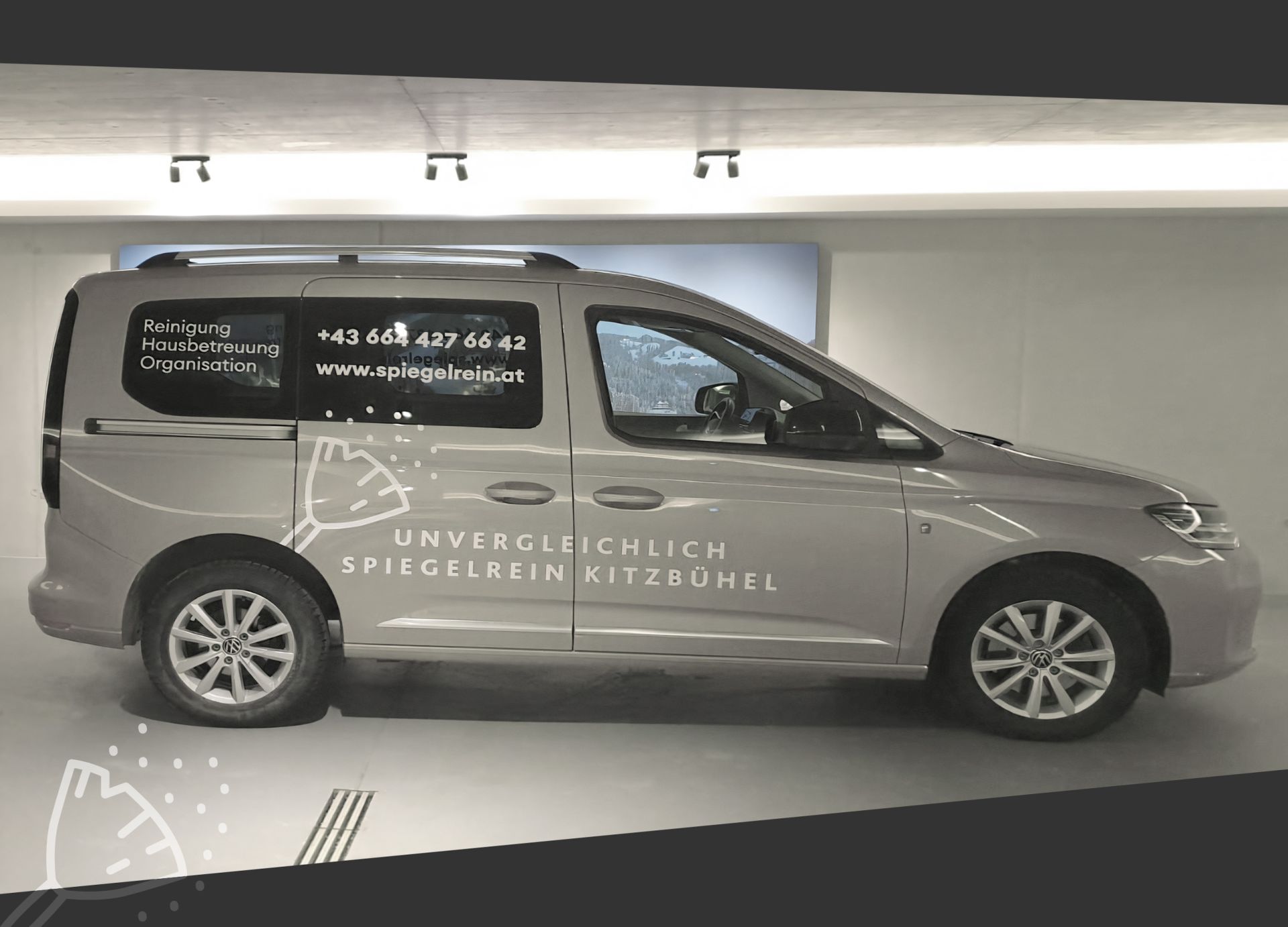
Spiegelrein Spasovski KG
Spiegelrein Kitzbühel
Corporate design, webpage, business cards and car wrap for the startup Spiegelrein in Kitzbühel
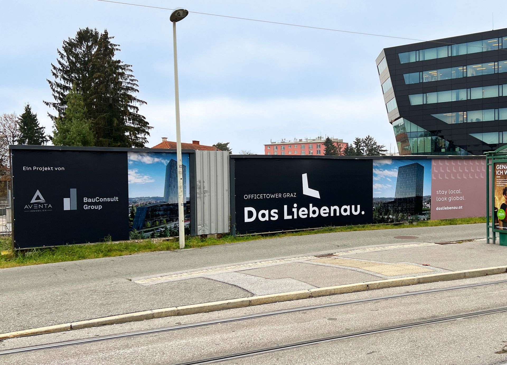
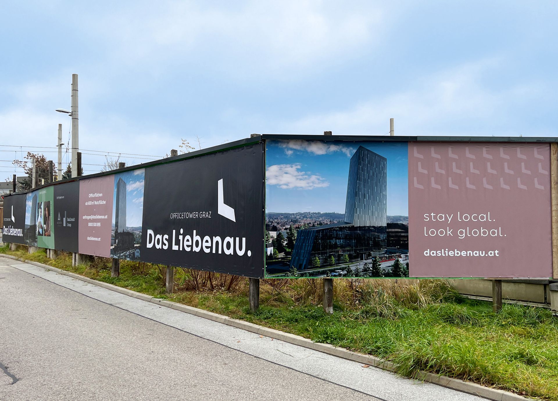
Liebenauer Tangente 8 Projekt GmbH (BauConsult und Aventa)
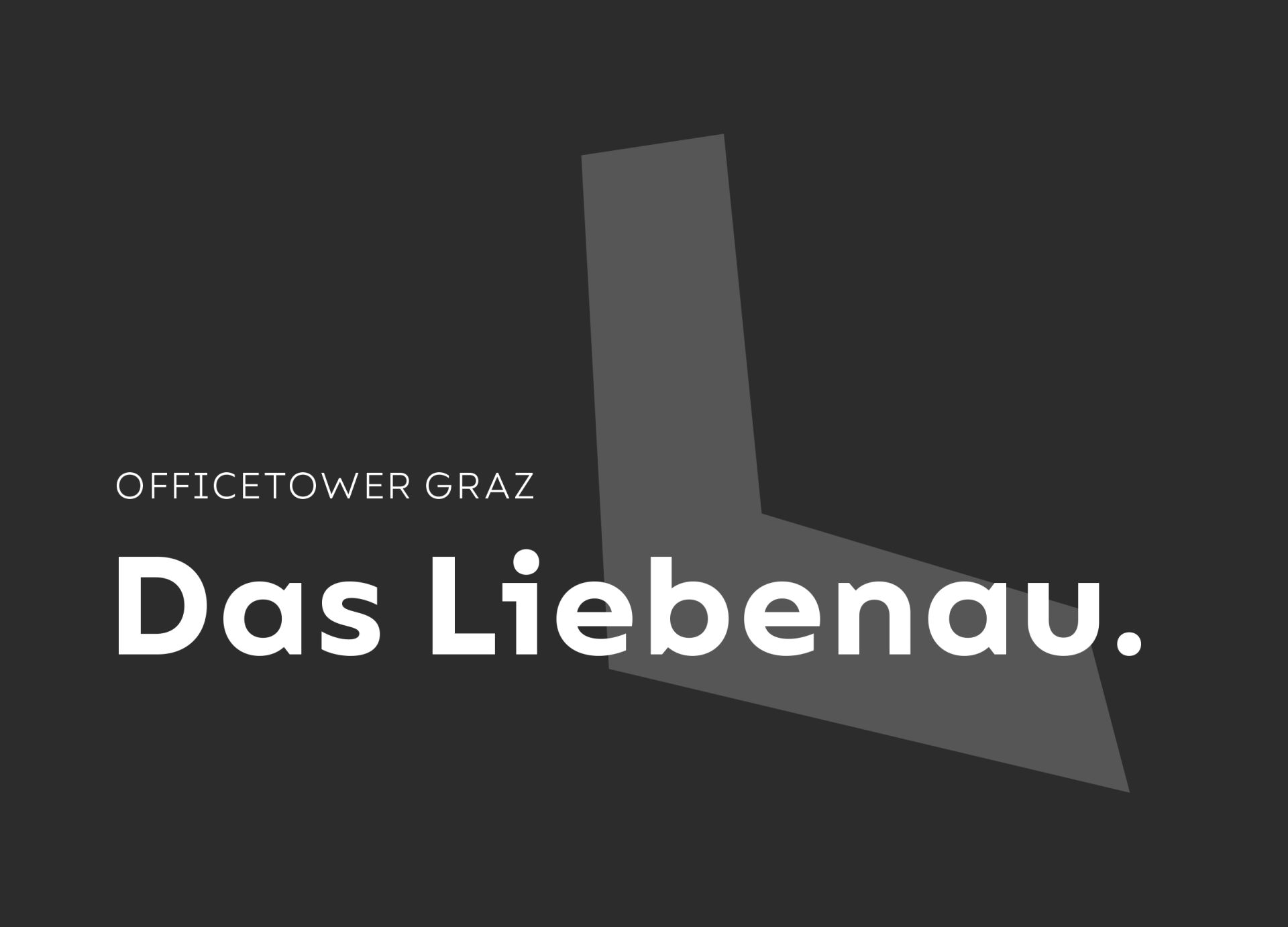
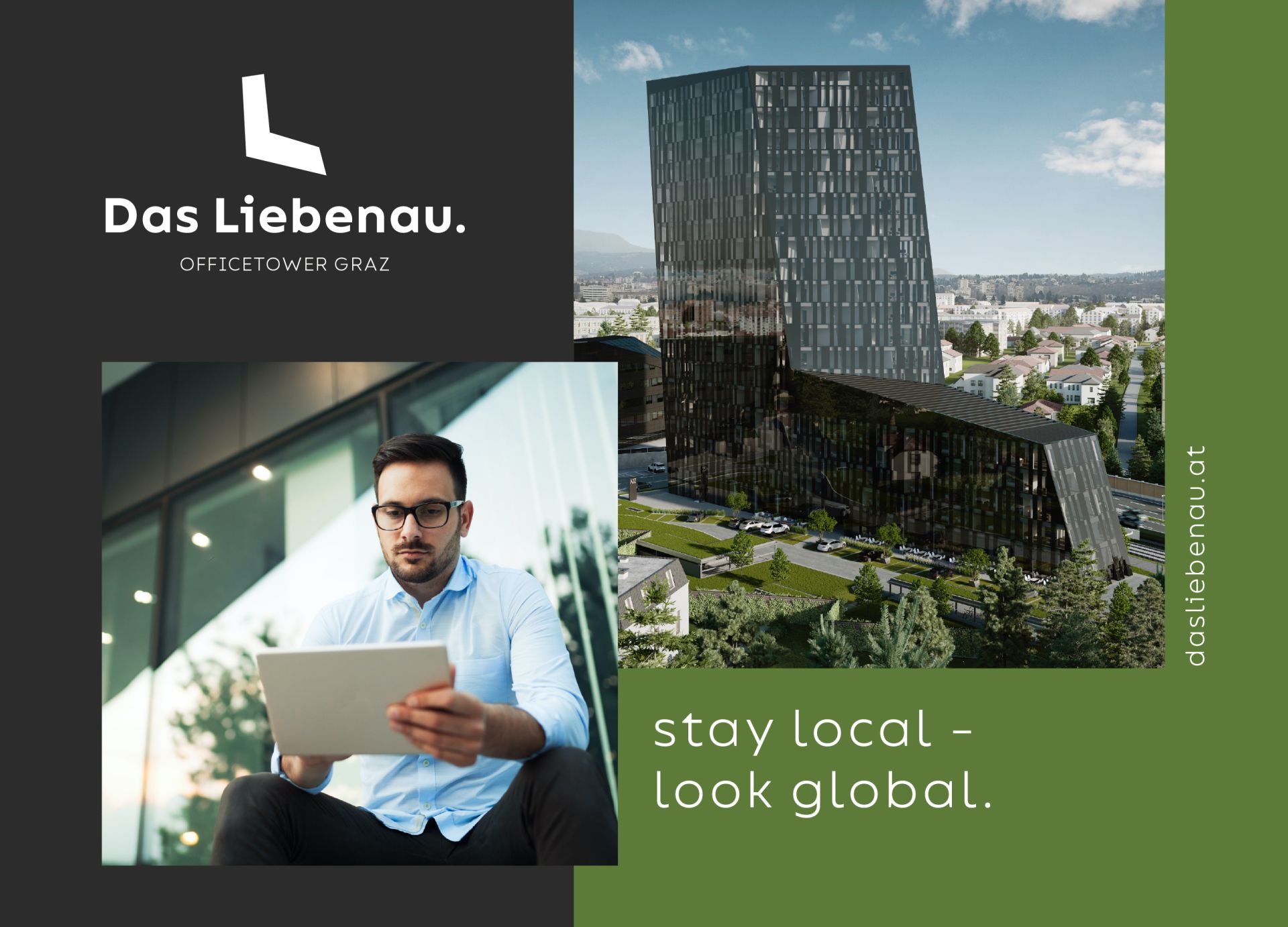
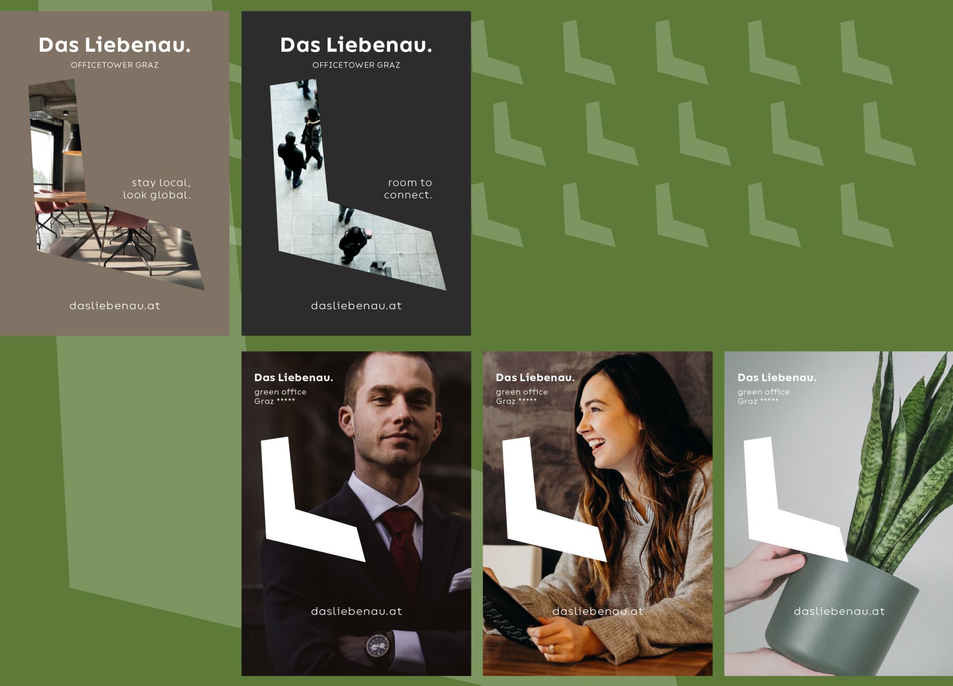
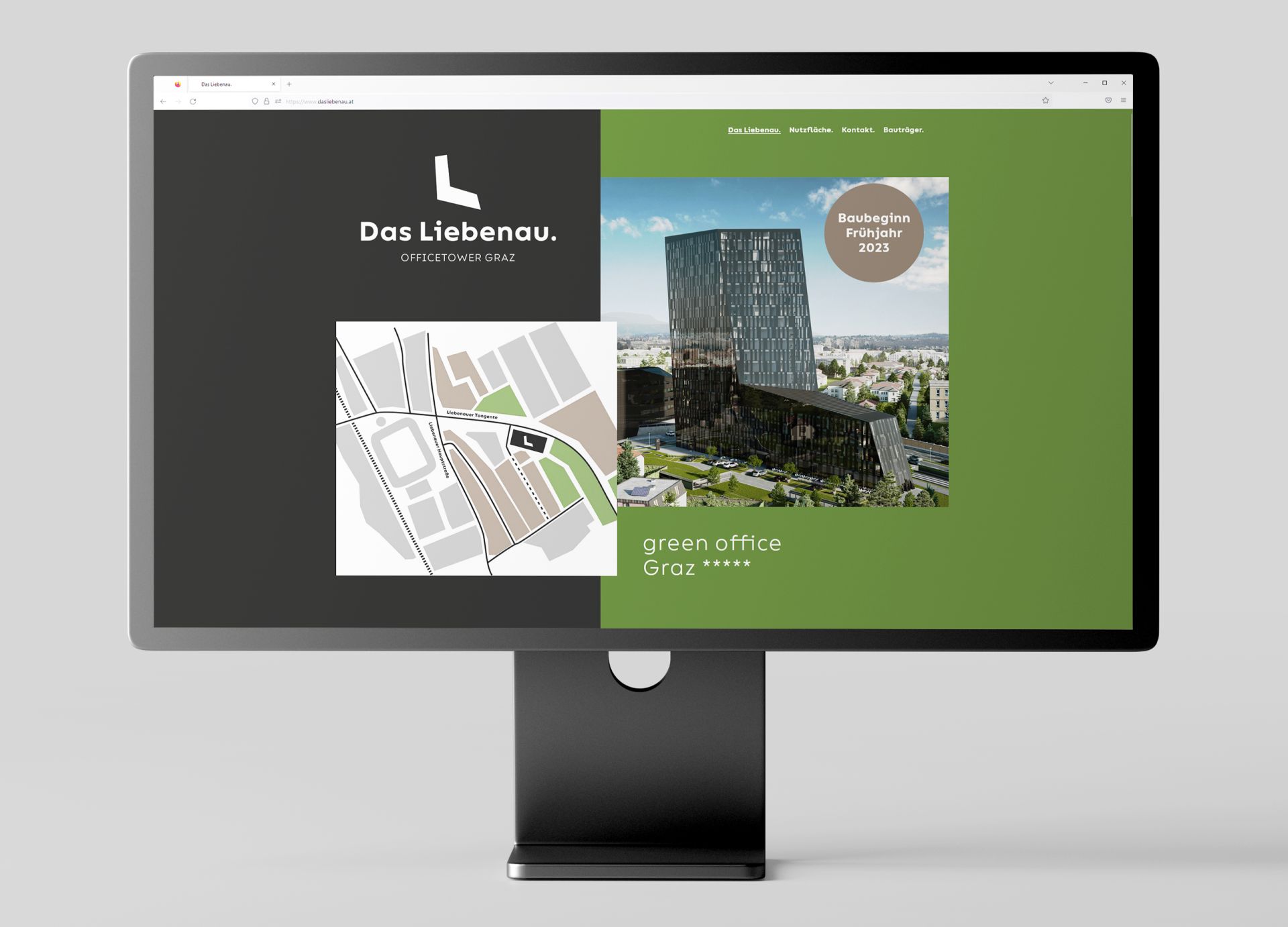
Das Liebenau. / The brand
A construction project becomes a brand. Our task: the creation of the name, the logo and the word picture mark. The shape of the building and the address, the Liebenauer Tangente were decisive for the staging. The down-to-earth color scheme and the development of the 3 slogans harmoniously round off the brand.
Liebenauer Tangente 8 Projekt GmbH (BauConsult und Aventa)
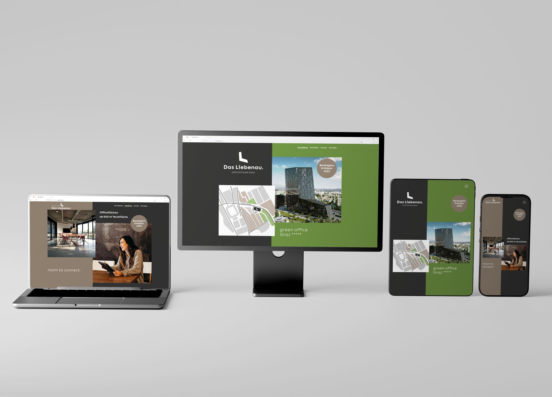
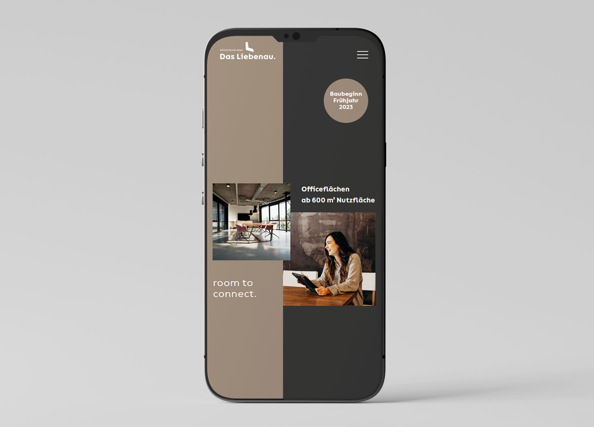
Das Liebenau. / The webpage
In line with the new brand, there is the phase 1 landing page. Start of construction spring 2023. Phase 2 follows...
Liebenauer Tangente 8 Projekt GmbH (BauConsult und Aventa)
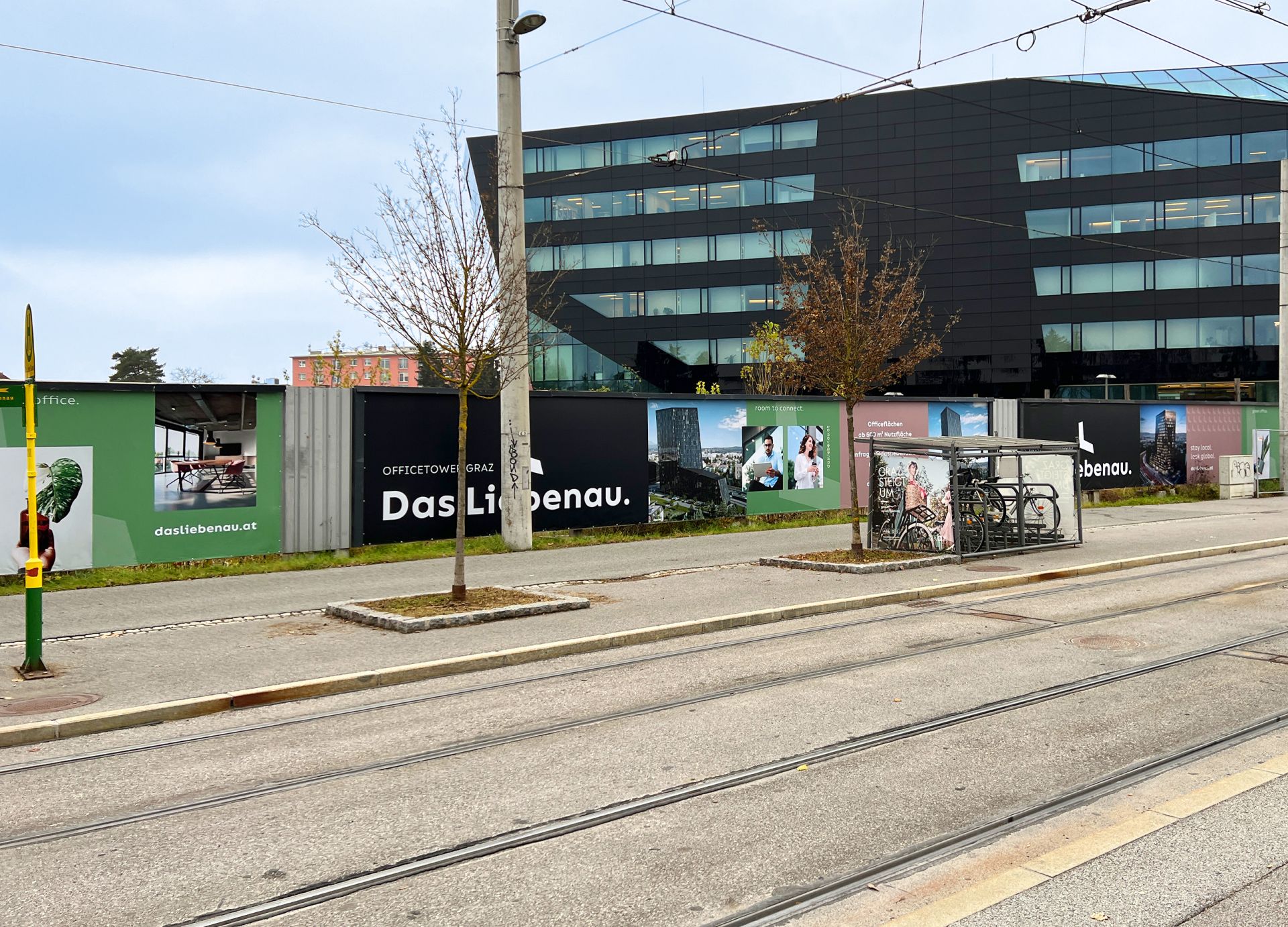
Das Liebenau. / Construction fence
On about 50 meters of construction fence, the color palette, the imagery and the basic elements are consistently and perfectly coordinated. Design, production and assembly by m3.
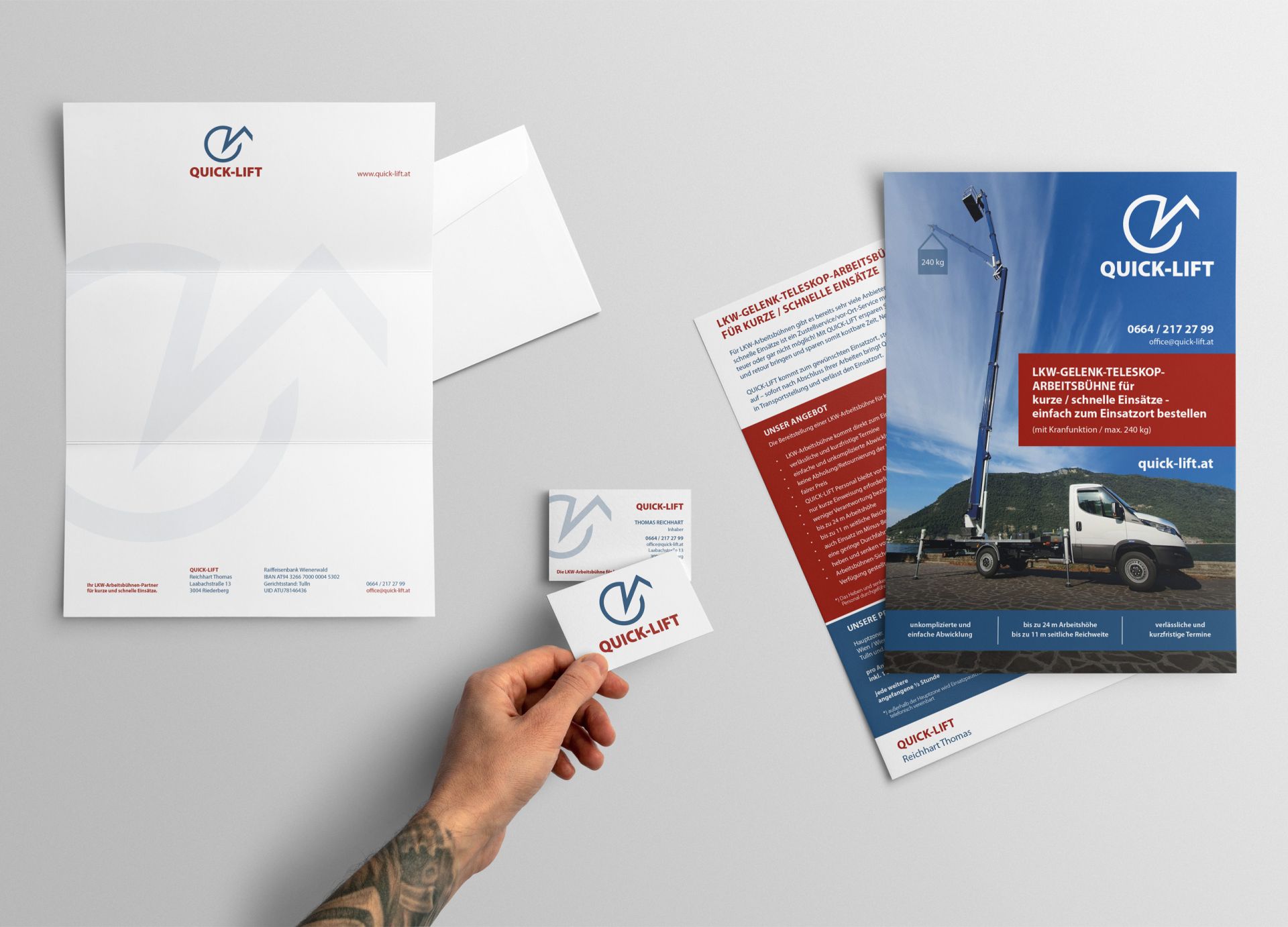
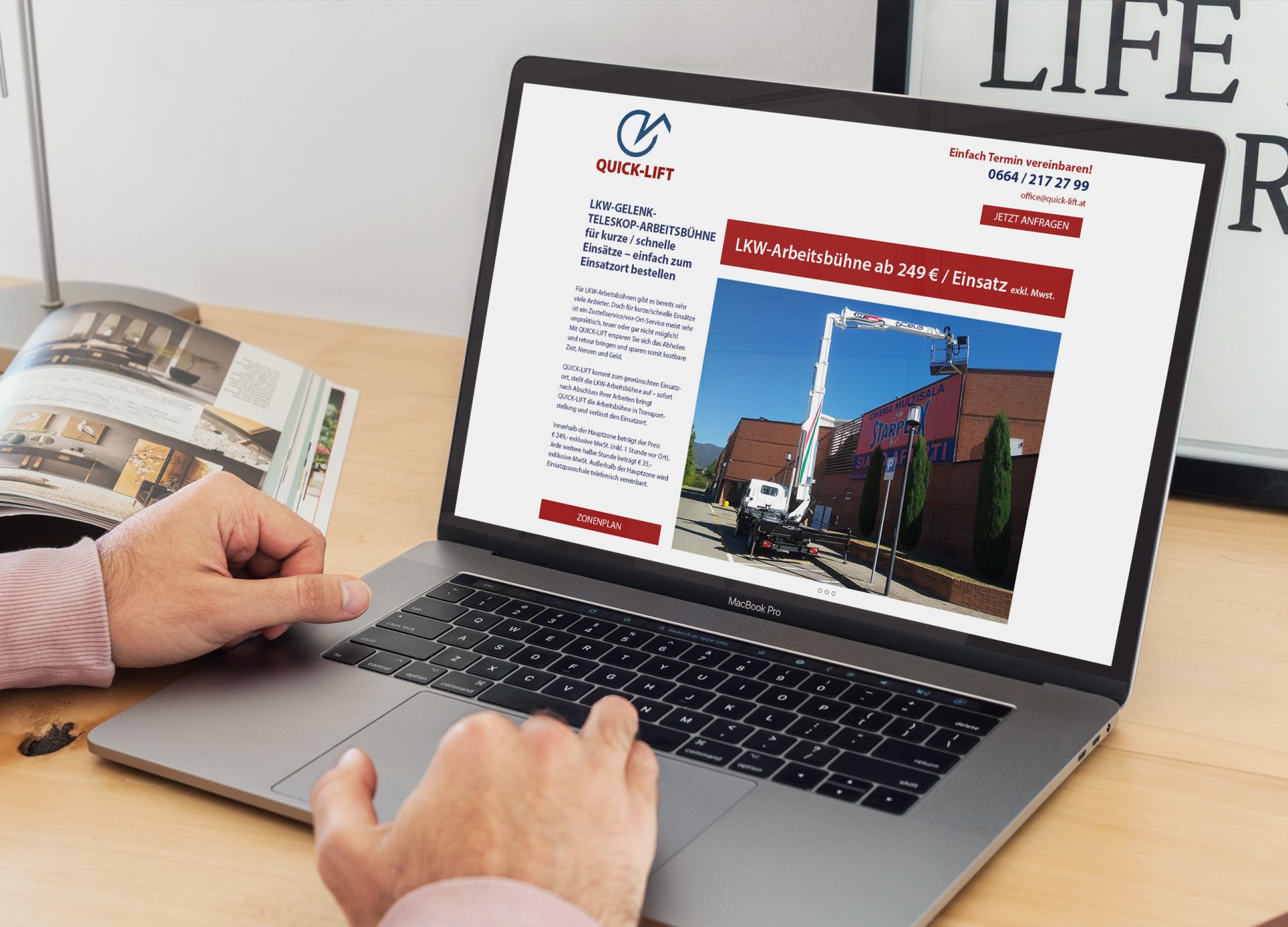
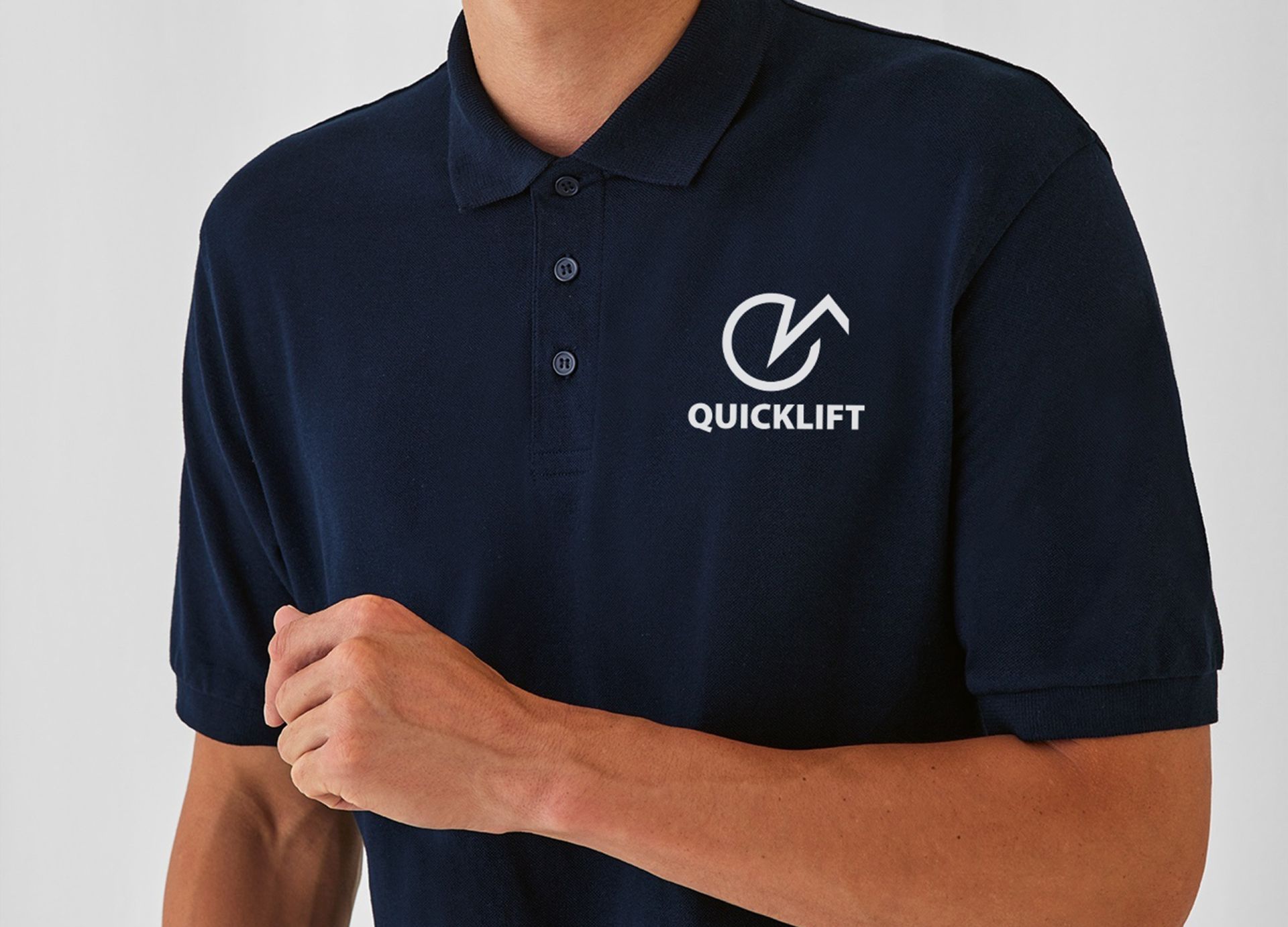
Quicklift
Logo and branddesign, info flyer including webpage
We were allowed to develop the logo, the corporate design, the info flyer and the webpage for the start-up.
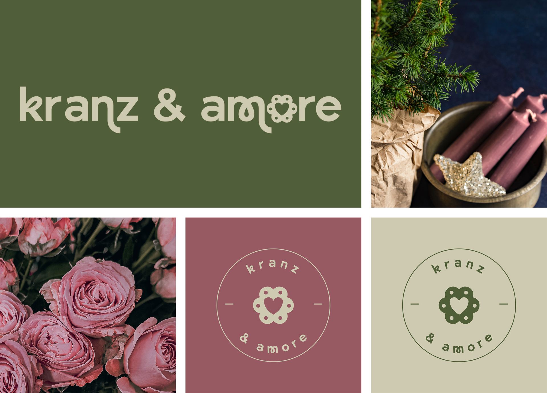
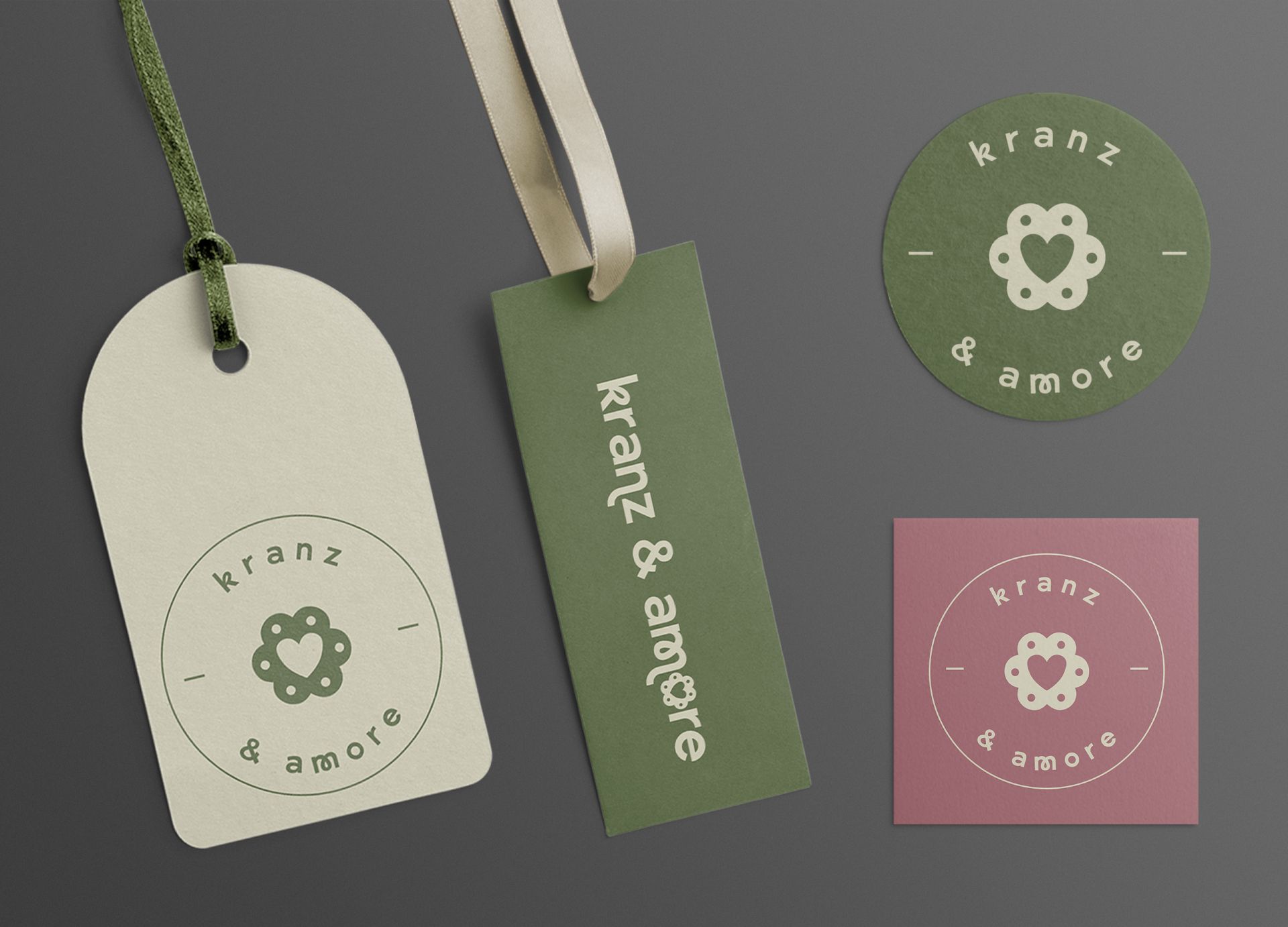
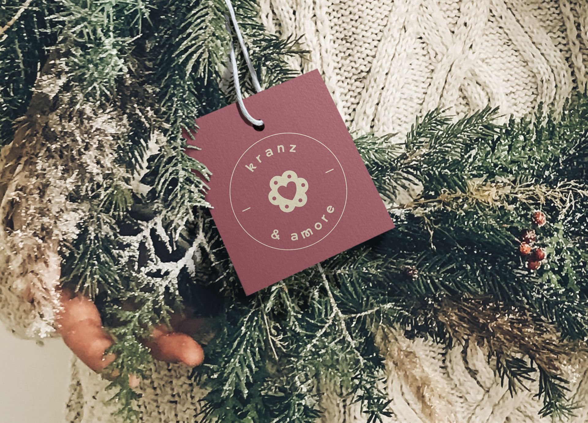
Verein Kranz & Amore
Logo and Corporate Design
Con tutto il cuore e con tanto amore. m3 has developed a logo and a corporate design for the association. A non-profit project. The association donates its income to the SOS Children's Village. We are happy to support this from the bottom of our hearts.
Bezirksvorstehung Innere Stadt
Logo and Corporate Design for the District Council of the 1st Municipal District of Vienna
The district administration under MMag. Markus Figl has been given a new face by mediadrei. The use of a basic element achieves a great effect. The new logo stands for unobtrusive elegance and clarity. The number 1 and the capital i form a unity. It is the 1st district and the residents of the Inner City are the 1st priority for the district administration.
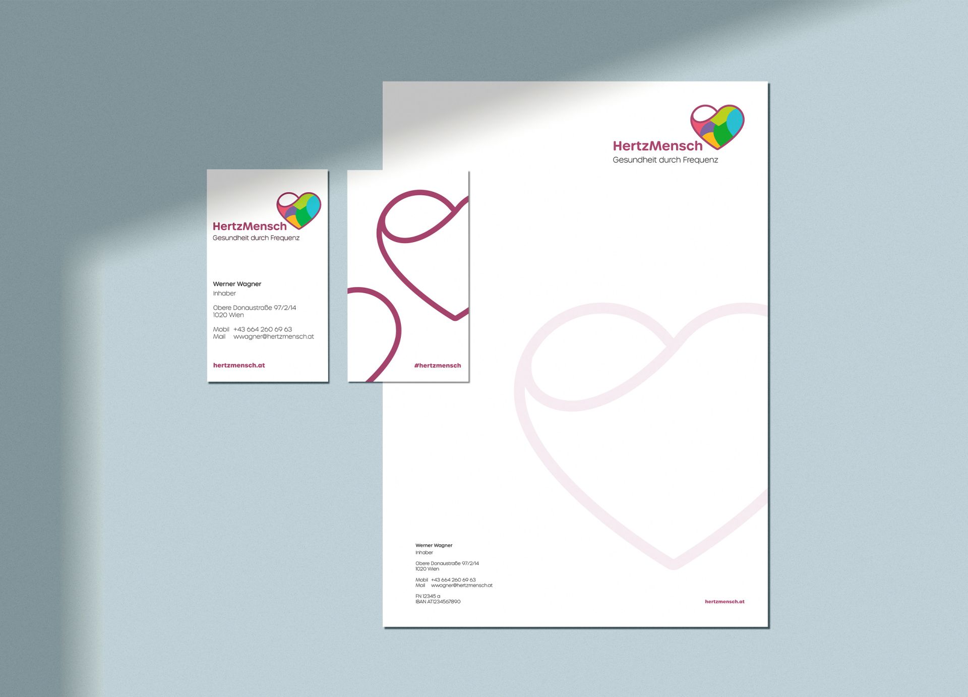
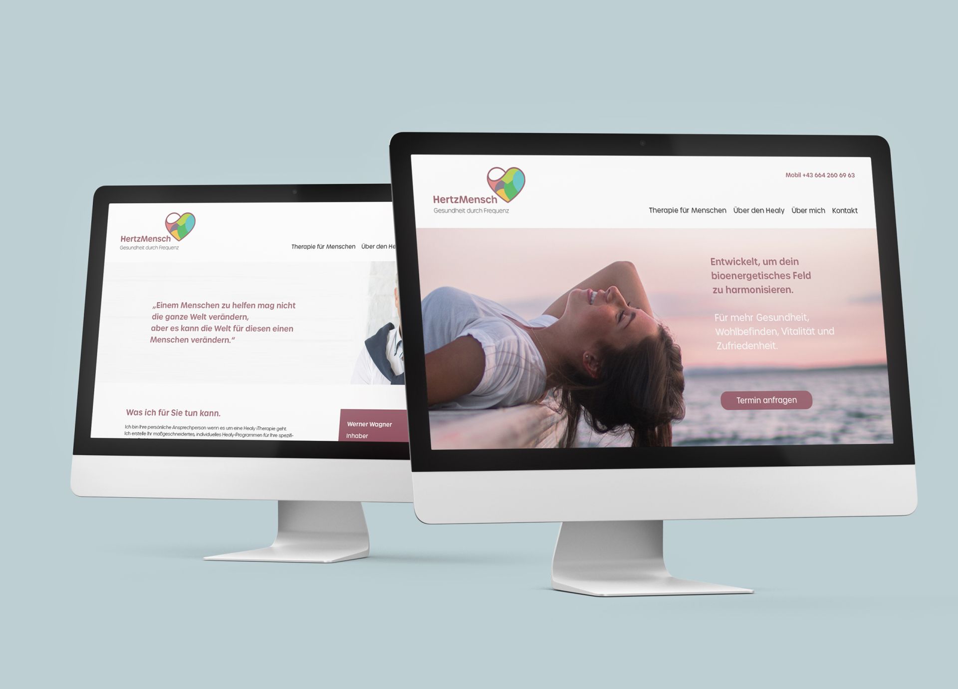
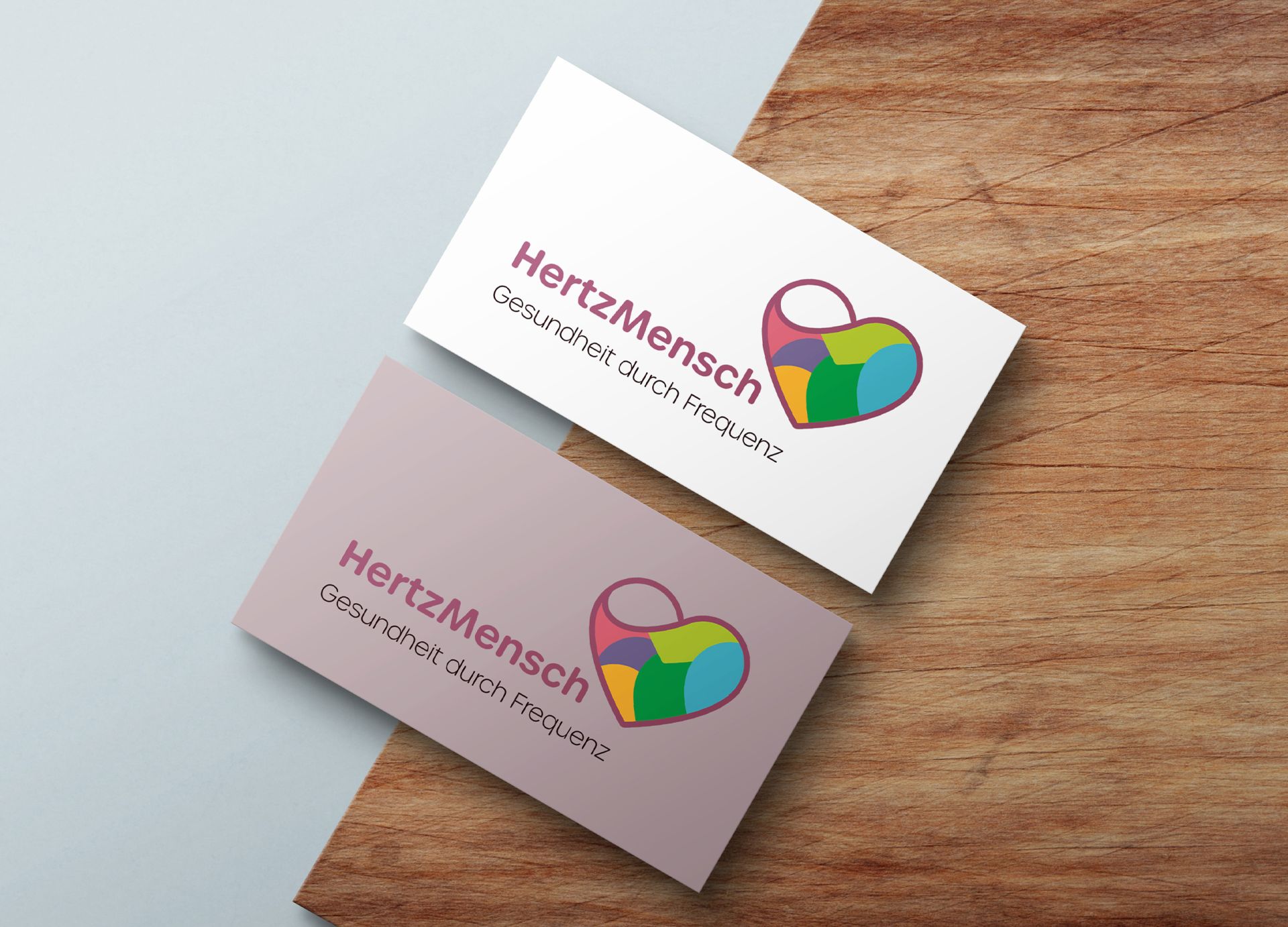
Hertzmensch
Logo, Corporate Design and Webpage
Design relaunch for Herztmensch. Creation of the new logo, colour spectrum and typography. The design concept was extended to all printed matter. The new webpage completes the new branding online.
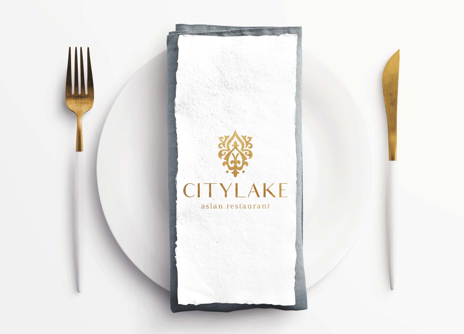
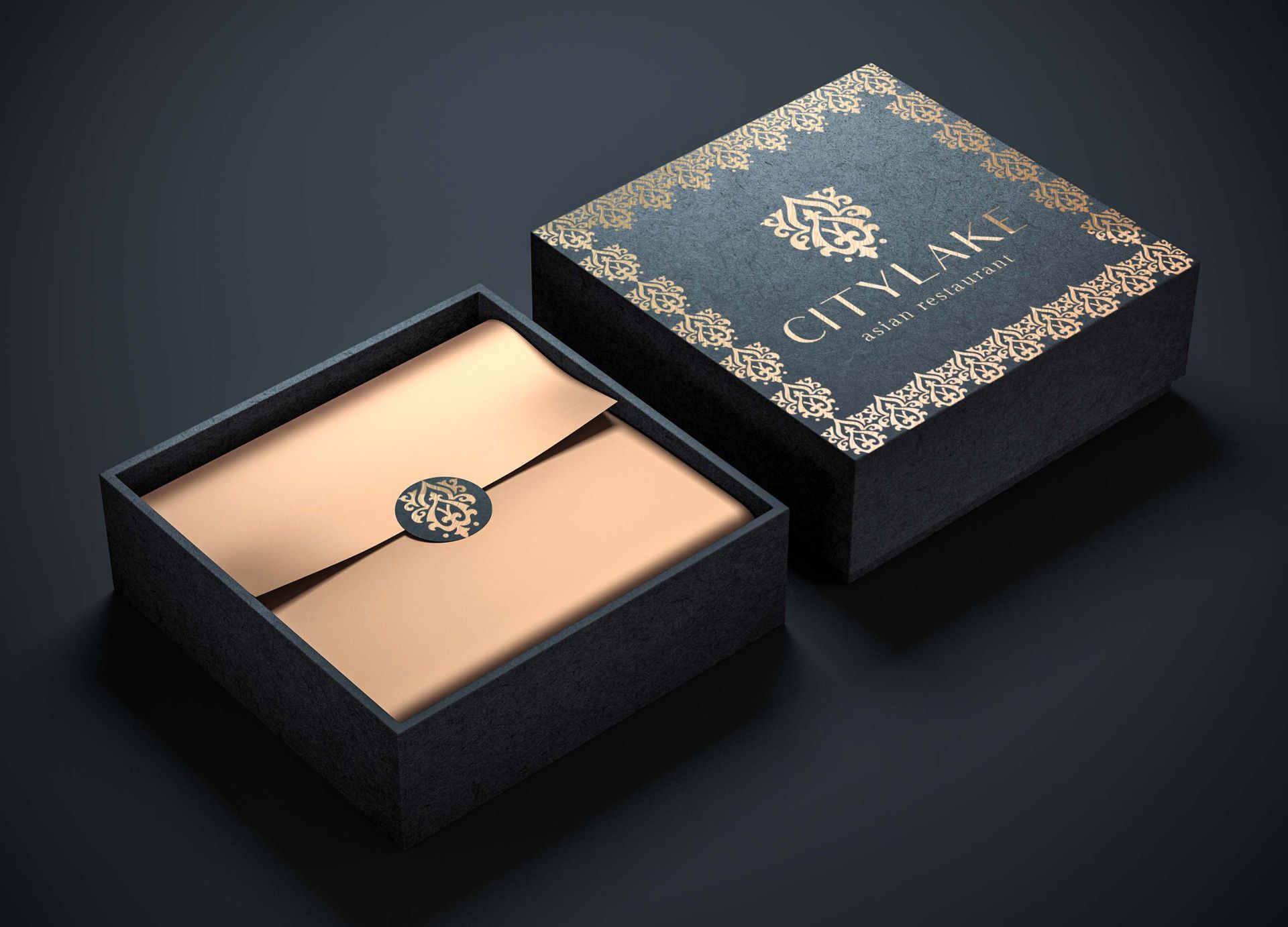
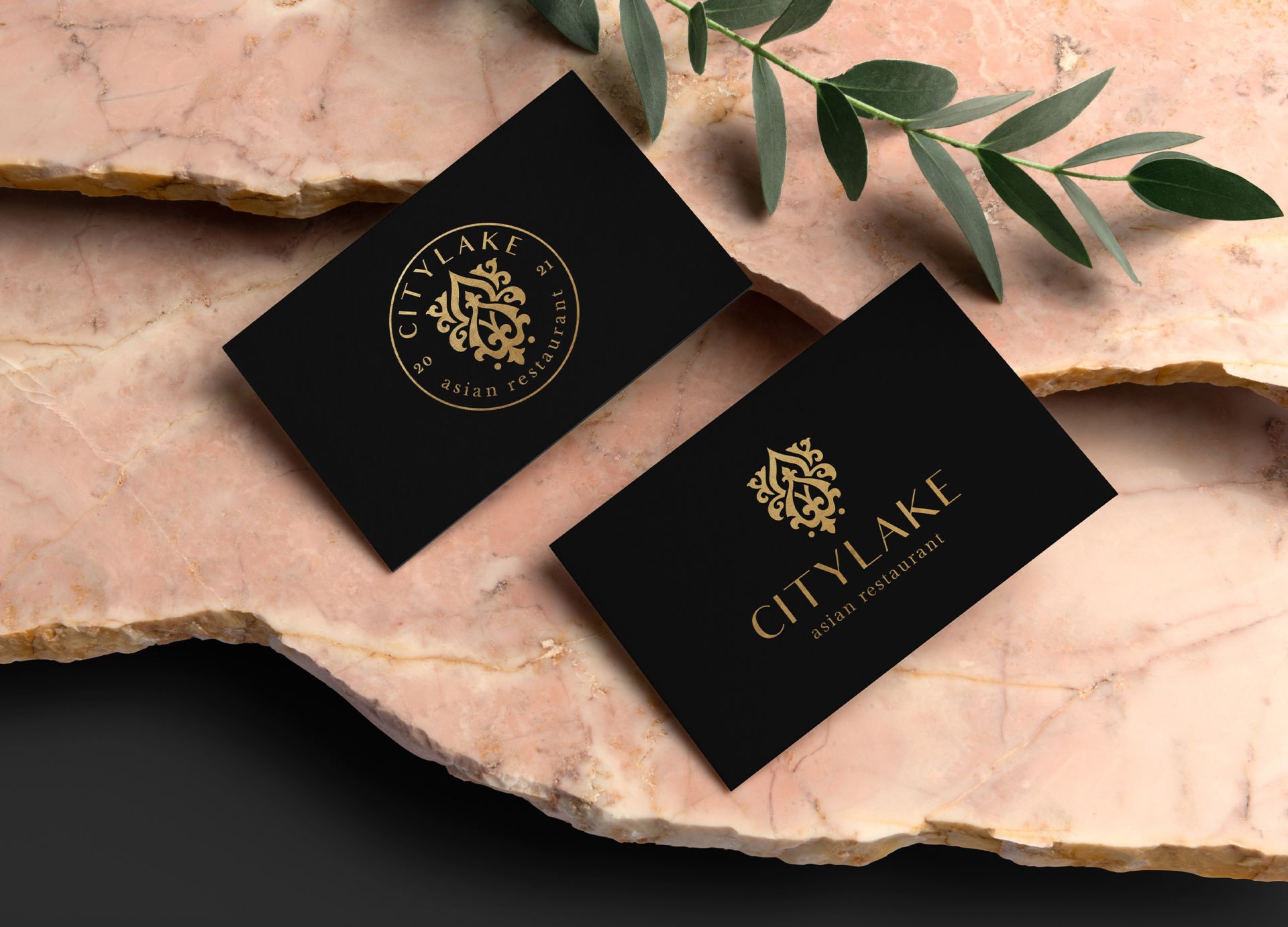
Citylake Gastronomie GmbH
Logo, Corporate- Packagedesign
Creation of the new logo and word mark. The incorporation of the K initials was a special customer request and was gladly realized. With the logo variant as a seal look, the brand has many branding possibilities. The exciting thing about the logo is the connection of the Persian roots of the owner with the food concept of the Asian restaurant.
Union Investment Real Estate
Austria AG
Gürtelturm Officecenter
Logo- and Corporate Design
New logo, color setting and typo solution for the corporate design of the belt tower. The two basic elements in the logo reflect the architecture and speak a clear language of form. The lobby was restaged with the illuminated logo and the color setting. Design and implementation all from one source.
There is much more to see - please browse the pages